Main Image
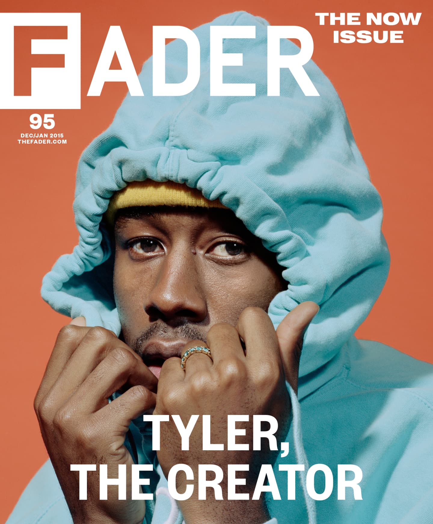
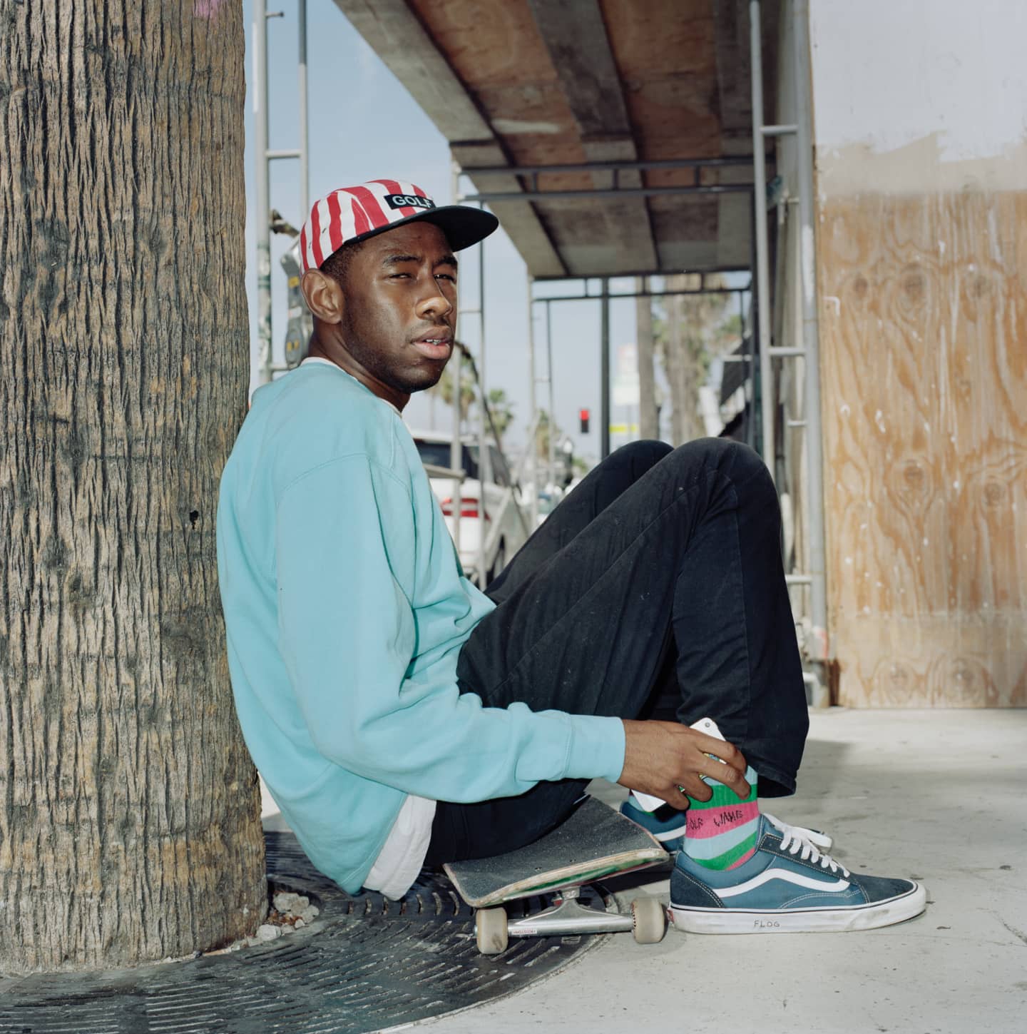
The main image shows Tyler, with his comfortable hoodie slightly covering his face. This could depict how he was heavily criticised for vulgar and graphic videos, with graphic and violent lyrics. However the colour heavily contrasts with recent release Wolf. His clothing represents his maturity and how comfortable he is in this setting. The bright turquoise hoodie represents his rebellious nature but they way he holds it tight could represent that it is a part of him and how he will always be.
Masthead
The mast head is in a bold white font with the fader logo which would be easily recognised by any consumers of Fader. It is cleverly placed above Tyler not blocking his main image, this shows how the front cover greatly focuses on Tyler himself. This appeals to fans of tyler the creator more as they would see tyler and be more inclined to purchase the magazine. Furthermore it contrasts very well due to it overlapping the top of the main image and the orange pastel background. The simple font and colour of the text works well and allows the magazine to stand out and make it easily readable/noticeable on a shelf
House Style
The house style is dull pastel orange combined with white text and due to its simplicity the pastel orange background allow the main image to really stand out making it the main focus rather than the background.
Tags
The tag’s are very minimal on the front cover, revealing only the masthead, the magazines slogan, and a month and then in the bottom part of the celebrity name. This is done to make the main image the focus of the magazine as it is enough to bring people to purchase the magazine.
Anchorage Text
The text is related to the image as in the covers’ star “Tyler, the creator” the name serves as a confirmation of who the cover star is and also another opportunity to grab people’s attention when it is on shelves.


No comments:
Post a Comment